Have you ever paused mid-scroll to ponder about the subtle, yet pivotal role the font plays in this experience? What font is the iPhone text? It’s a silent performer, ensuring readability and aesthetic appeal, yet it often goes unnoticed.
The iPhone uses the “San Francisco” font, which was designed by Apple and introduced with iOS 9. It is now the default font for iOS, macOS, and watchOS, and is known for its clean, legible, and aesthetically pleasing characteristics. Hence, ensuring optimal user experience across Apple devices.
But what happens when this unsung hero doesn’t quite hit the mark? Frustration? Eyestrain? A subtle, nagging feeling that something’s amiss? Let’s dive into the nuanced world of fonts. Hence, exploring their evolution within the iPhone ecosystem, and unravel the mystery behind those crisp. Also, clean letters that dance beneath our fingertips. What font is the iPhone text?
See Also: How Much Does Apple Charge To Unlock A Disabled iPhone?
Contents
The Evolution Of Fonts In iPhones
Embark with me on a typographical journey through the epochs of iPhone’s textual display, where each iPhone font has whispered stories of the times and tech it lived through. The iPhone, a device we’ve all held close, has seen a fascinating evolution in its fonts, each shift subtly altering our digital interaction and experience.
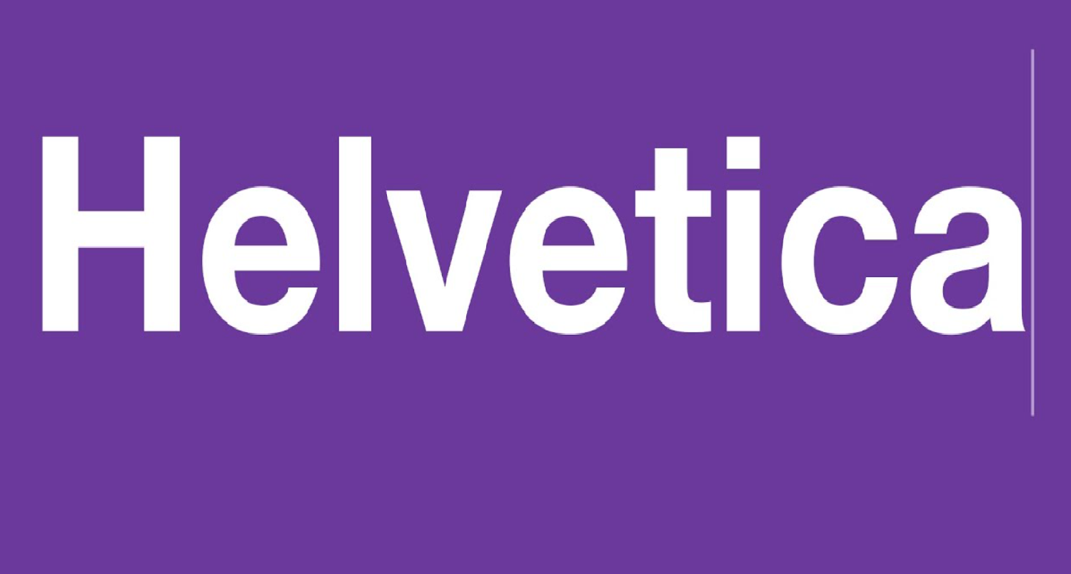
- The Helvetica Era: In the dawn of the iPhone, Helvetica gracefully adorned the screen, offering a clean, sans-serif simplicity that mirrored the innovative, user-friendly ethos of Apple. Helvetica, with its unassuming charm, became the silent companion to our texts, emails, and searches. However, gently guiding our eyes through the sleek new world of smartphones.
- Transition To Helvetica Neue: As technology and screens evolved, so did the fonts that danced upon them. Enter Helvetica Neue, a refined sibling, offering a lighter, more modern aesthetic, yet maintaining that familiar, friendly vibe. Hence, it whispered of progress, a subtle shift towards a future where clarity and minimalism reigned supreme.
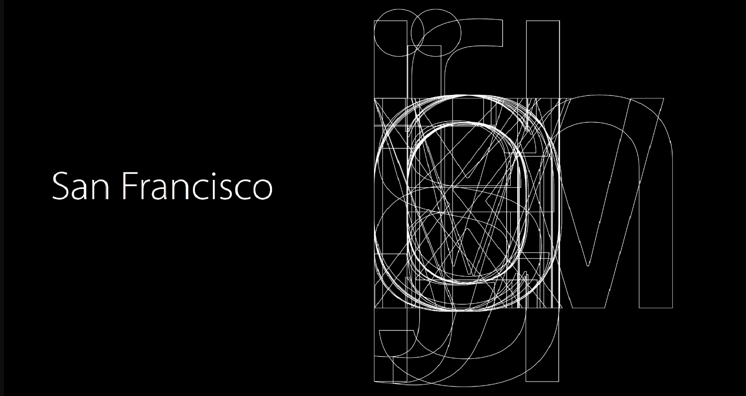
- The Introduction Of San Francisco: With the ushering in of iOS 9, we met San Francisco – a SF pro font that spoke the language of every device in the Apple ecosystem. Crafted meticulously by Apple designers, San Francisco was not merely a font. Hence, it was a declaration of a unified, cohesive digital experience across all platforms, ensuring legibility, consistency, and a touch of modernity in every character displayed.
In this evolution, we witness not just the transition of fonts, but a reflection of technological advancements and a nod to the ever-changing user experience. Each font, in its time and place, has offered us a unique, textual lens through which we’ve engaged with our digital world, silently shaping our interactions and experiences.
See Also: Can Android See When iPhone Is Typing?
San Francisco: The Signature Font Of Apple
Ah, San Francisco! Not just a city, but a name that resonates through the sleek, digital corridors of Apple’s devices. Introduced with a whisper and evolving with a roar, the San Francisco (SF) font has become synonymous with the seamless, unified user experience that Apple prides itself on. What font is the iPhone text? But what makes SF not just a font, but a signature, a silent ambassador of Apple’s design philosophy?
- Design And Aesthetics Of San Francisco: Embarking into the realm of SF, we’re greeted with a design that is quintessentially Apple – clean, user-friendly, and modern. It’s not merely a typeface but a meticulous blend of aesthetics and functionality. SF is crafted to prioritize legibility, ensuring that each character is not only a visual delight but also effortlessly readable, whether you’re glancing at your watch or scrolling through your iPad. Hence, it’s a font that doesn’t scream but rather, gently whispers the ethos of Apple – simplicity married with functionality.
- Implementation Across Apple Devices: SF doesn’t just reside in one device. Hence, it travels across the Apple ecosystem, providing a consistent, unified textual experience. From the compact Apple Watch to the expansive canvas of Mac, SF scales beautifully, maintaining its aesthetic integrity and legibility. Hence, it’s a Apple font that morphs subtly, ensuring that whether you’re reading a notification on your watch or typing out an email on your Mac, the experience is consistently Apple.
- Language Support And Versatility: In the global digital village, SF speaks many languages, quite literally. Supporting a myriad of languages across Latin, Greek, and Cyrillic scripts, it ensures that the Apple experience is not lost in translation. Hence, it’s a font that embraces diversity, ensuring that users across the globe are greeted with the same visual warmth and clarity, irrespective of the language they speak.
See Also: Why Do iPhone Chargers Crack? 6 Common Reasons Explained
The Impact Of Font Changes On User Experience
Imagine navigating your iPhone, the words a jumbled, unreadable mess, disrupting your digital journey with every tap and swipe. Fonts, often the unsung heroes of our digital adventures, play a pivotal role in crafting our user experience. Hence, silently shaping our interactions and digital dialogues. The evolution of fonts was in iPhones, from Helvetica to the signature San Francisco. Hence, it has been a journey not just of aesthetic transformation but also of enhancing user engagement and interaction.
- Legibility And Accessibility: The shift from Helvetica to San Francisco wasn’t merely a change. Hence, it was a thoughtful transition towards enhanced legibility and accessibility. San Francisco, with its adaptable and clear design, ensures that texts are not just words on a screen but readable. Hence, accessible entities that guide users through their digital interactions, whether it’s reading a text or browsing through apps.
- Aesthetic Consistency Across Devices: Consistency is key in user experience, and the introduction of San Francisco across Apple devices ensured a unified, cohesive visual journey. Whether you’re glancing at your Apple Watch or working on your Mac, the consistent text font aesthetic provides a seamless, familiar experience, subtly bridging various Apple devices through a unified textual design.
The impact of these font transitions on user experience is profound, intertwining aesthetics with functionality. Hence, crafting a user experience that’s uniquely, undeniably Apple. It’s a testament to the meticulous, user-centric design philosophy that Apple adheres to. Hence, ensuring that every element, down to the font, enhances and elevates the user experience.
How To Customize Fonts On Your iPhone?
Ah, the joy of personalization! Your iPhone, a device that’s almost an extension of yourself, offers a delightful array of customization options, and fonts are no exception. What font is the iPhone text? Ever gazed at the sleek letters on your screen and wished for a dash of personal flair? Your wish is iOS’s command!
- Changing System Fonts: While Apple doesn’t allow a change in the system font, you can explore a variety of fonts in specific apps like Mail, Notes, and Pages. Simply tap the “Aa” icon, and voilà, a palette of fonts awaits your selection! Your emails and notes can now echo your personal style, with fonts that add that extra dash of character.
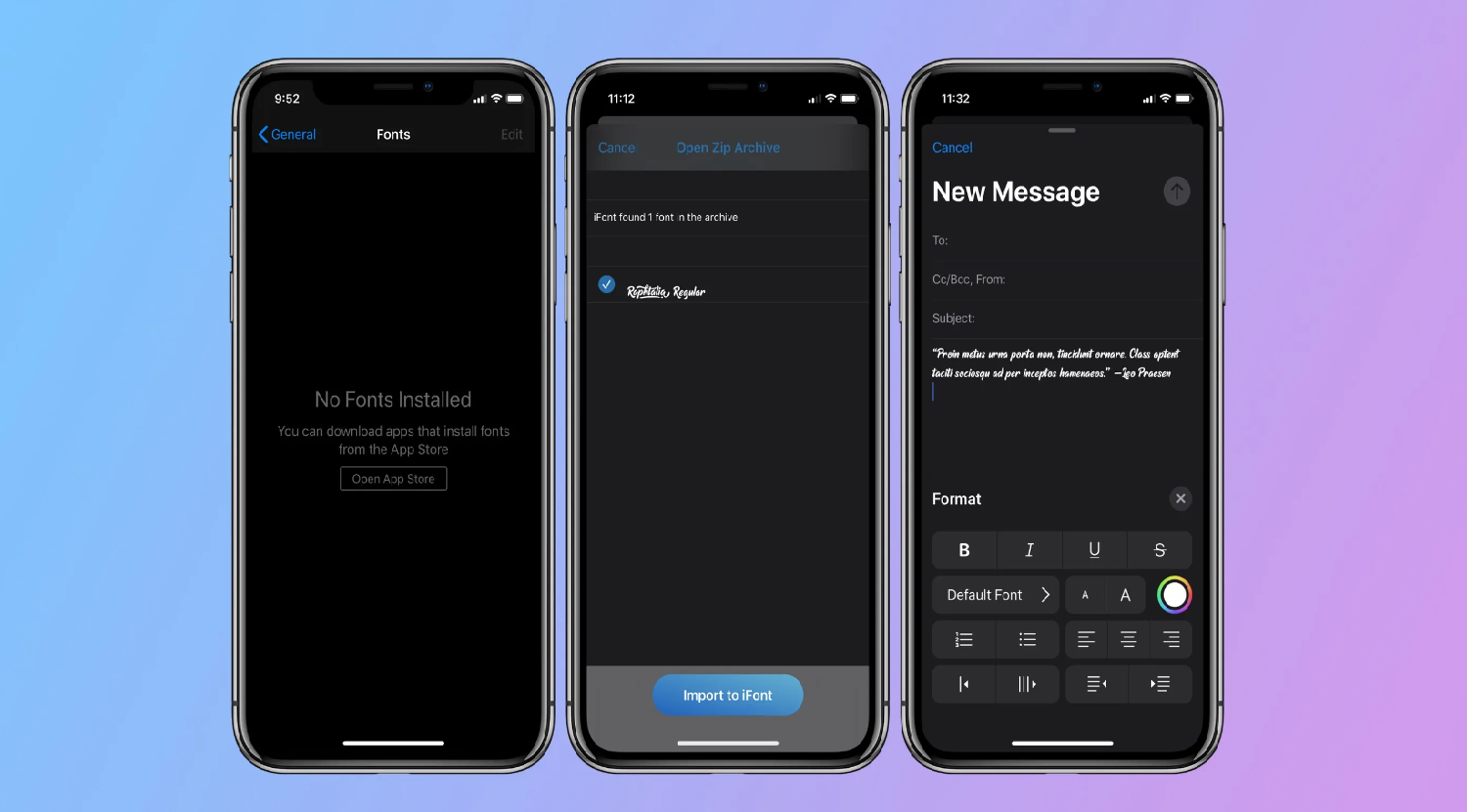
- Installing Custom Fonts: With iOS 13 and above, the doors to custom fonts are flung wide open! Head to the App Store, find a SF pro font download app that catches your fancy, and download. Navigate to Settings > General > Fonts, and your downloaded fonts will be there. Be ready to add a sprinkle of typographical magic to your documents and creations.
In the realm of fonts, your iPhone allows you to play, explore, and express, ensuring that your digital words resonate with your unique style. So, dive in and let your texts be a reflection of the wonderfully unique you!
See Also: How To Know If Someone’s Phone Died iPhone: Signs & Tips
FAQs
What font does Apple use?
Apple uses the San Francisco font, introduced with iOS 9, across its devices, ensuring a consistent and legible user experience. It’s known for its clean and modern aesthetic screen sizes.
Can I change my iPhone’s font?
While you cannot change the system font on your iPhone, you can customize fonts in specific apps like Mail, Notes, and Pages. Next, install custom fonts for use in various applications with iOS 13 and above.
Why did Apple change its font to San Francisco?
Apple introduced San Francisco to enhance legibility. Its design adapts gracefully to various screen sizes, ensuring clarity and aesthetic appeal in every digital interaction.
How to download fonts that are custom on my iPhone?
To install custom fonts on your iPhone, download a font app, and navigate to Settings > General > Fonts. Your downloaded fonts will be available there for use in compatible applications.
Conclusion
Embarking on this typographical journey through the iPhone’s textual landscape, we’ve explored the silent, yet potent power of fonts in shaping our digital experiences. From the classic Helvetica, through the refined Helvetica Neue, to the signature San Francisco. Here, each font has whispered tales of technological evolution and enhanced user experiences.
The ability to customize fonts, adding our personal flair, further enriches our digital dialogues. What font is the iPhone text? As we tap, swipe, and type, let’s appreciate these unsung heroes, ensuring our digital words are not just seen but felt. Hence, crafting experiences that are uniquely, delightfully us. Here’s to the fonts, the silent architects of our digital narratives!
See Also: How To See Through Marker On iPhone: Tips & Tricks

Hello, I am McKenzie and I am totally obsessed with getting the best experience out of every device that I use. Hence, I started this blog to help others make the most of their devices and fix errors in a jiffy! :)